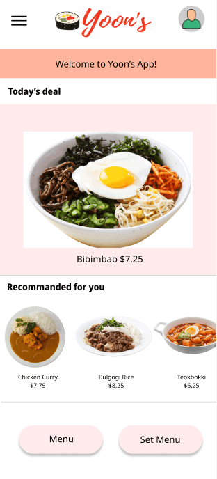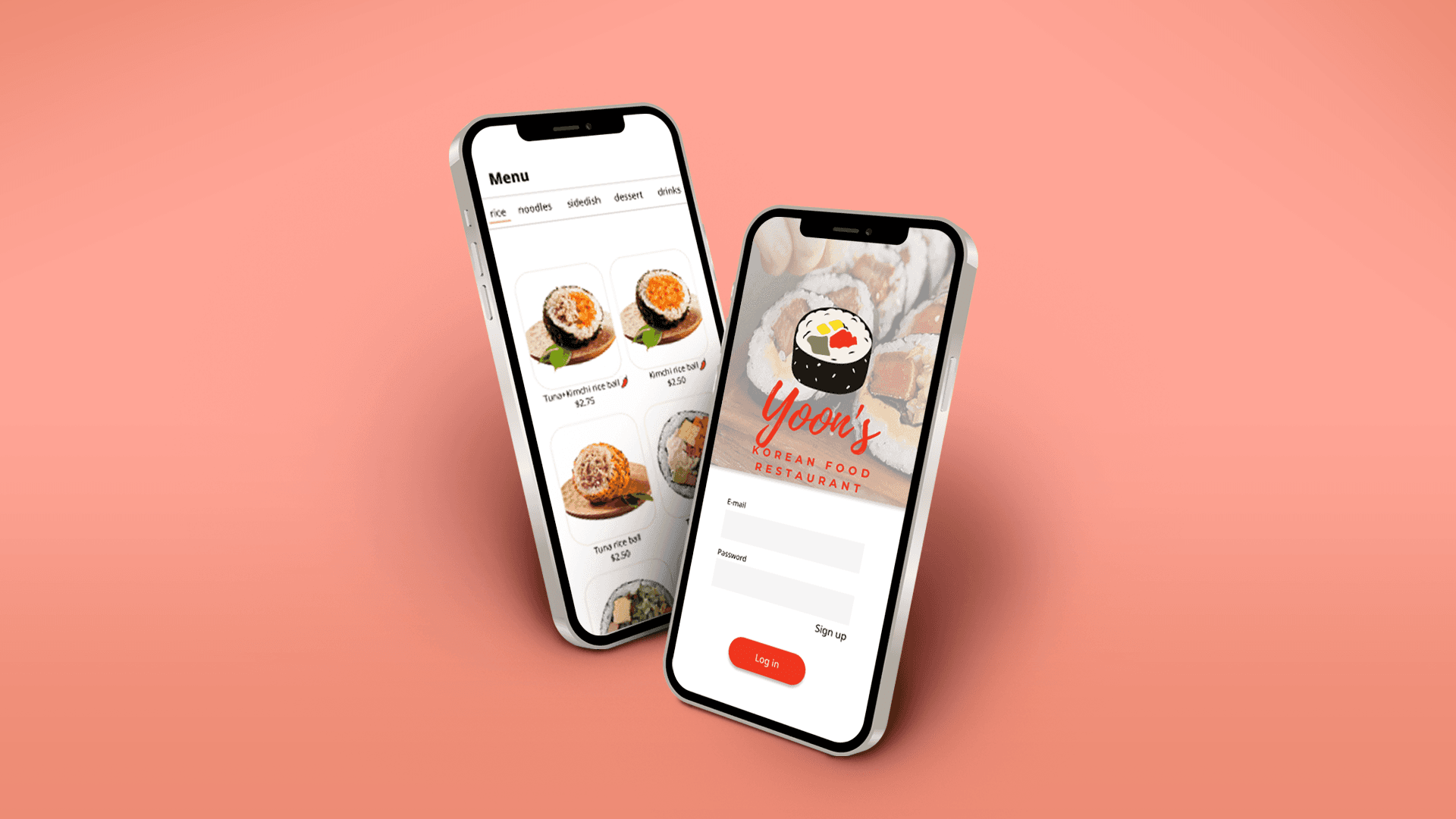
As a UX/Graphics Designer, I had the privilege of working on a project to design an app for Yoon's Restaurant, a Korean restaurant in a busy neighborhood. My goal was to create an app that would not only attract and retain customers in their online system but also increase sales for the restaurant.
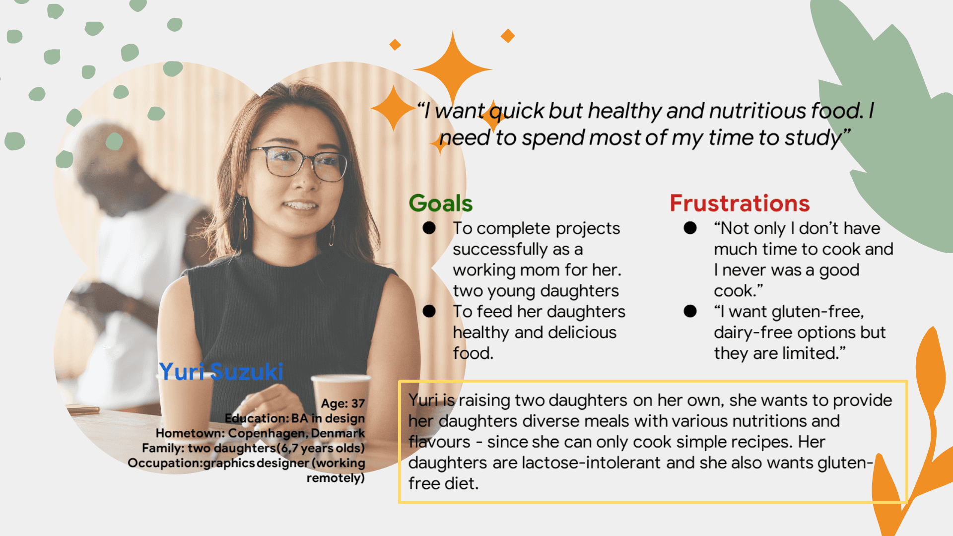
To begin the design process, I conducted extensive user research to gain a better understanding of the target audience and their needs. Through surveys and interviews with potential users, I identified their pain points and expectations for a restaurant app. I also developed a user persona named Yuri, who is a busy young professional with a preference for Korean food.
Using this information, I created a detailed wireframe of the app, outlining each screen's layout and functionality. I worked closely with the client to ensure that the app's design was aligned with their branding and business goals.
Once the wireframe was approved, I created a prototype of the app using Figma and Adobe Creatives. This allowed us to test the app's functionality and user experience before moving on to development.
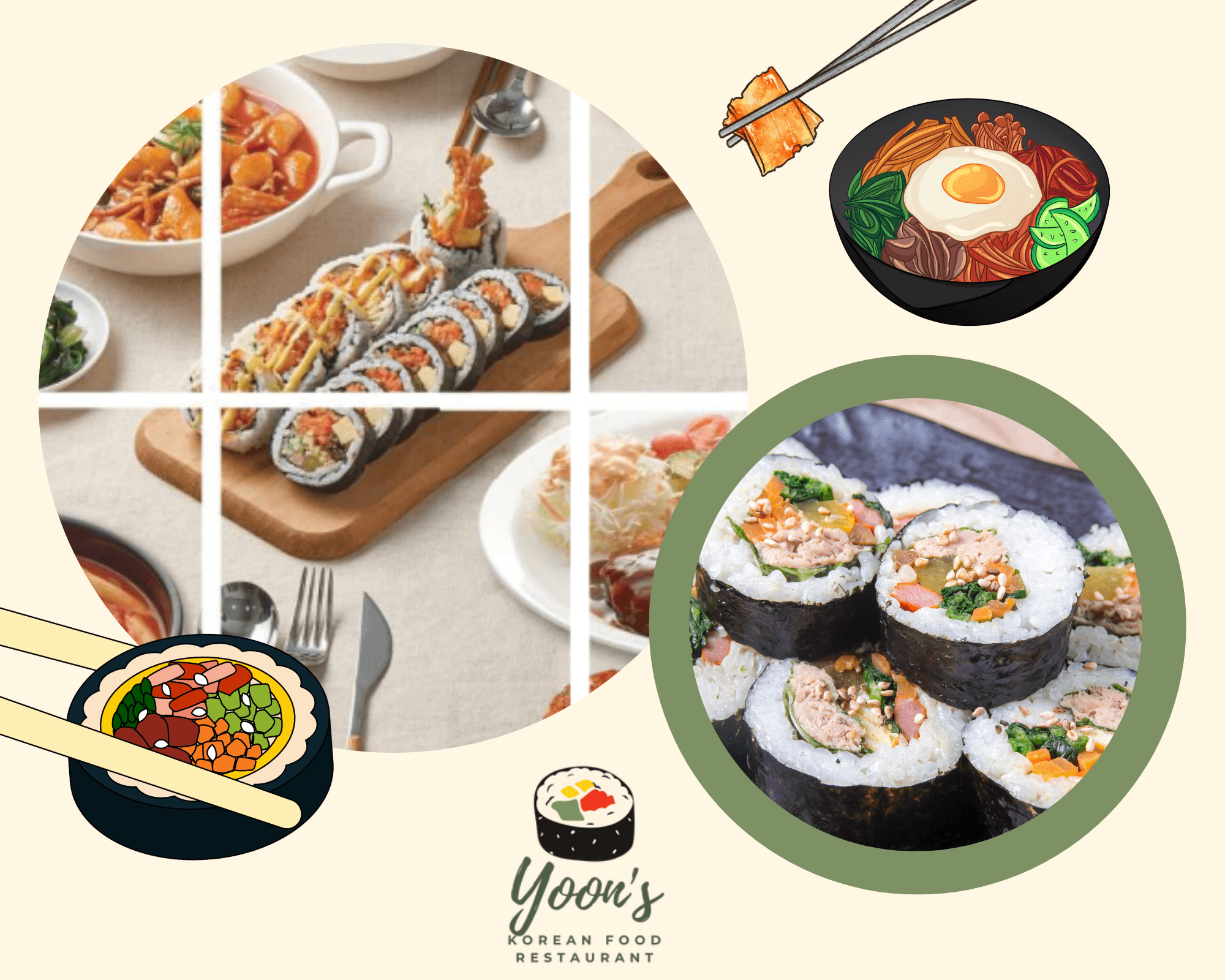
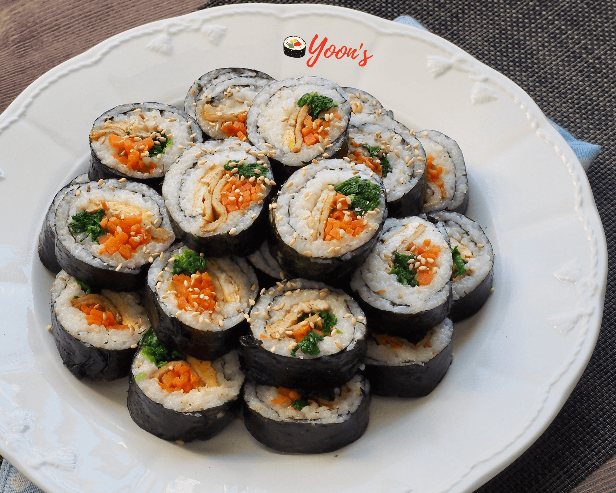
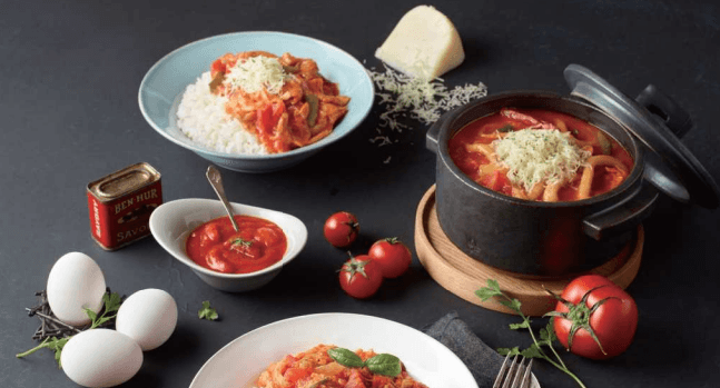
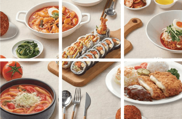
Throughout the prototyping and wireframing process, I focused on making the app visually appealing and easy to use. I used Yoon's Restaurant's branding colors, with a focus on the restaurant's signature menu and the most obvious color of the dishes such as pink, red, yellow and green. I included high-quality images of the restaurant's dishes to entice customers and showcase their offerings.
There are some findings of userability test after the wireframing process.
1. Users wanted a clearer sign-up process.
2. Users wanted menu to scroll to show more content.
3. Users wanted the home page to have more recommendations.
4. Users wanted to amend delivery times and payment types.
Based on the findings, to make the ordering process more intuitive, I included a simple and easy-to-use menu with clear descriptions of each item. I also added a feature that allows customers to customize their orders and add notes for any special requests.
One of the biggest challenges we faced was the lack of integration between the restaurant's online system and the app. I worked closely with the restaurant's IT team to ensure that the app was integrated seamlessly with their existing online ordering system.
After the app was launched, I conducted user testing and received positive feedback from our users. Customers appreciated the app's easy-to-use interface, clear descriptions of menu items, and the ability to customize orders.
In conclusion, my work on the prototyping and wireframing process was instrumental in the success of the app for Yoon's Restaurant. By conducting extensive user research, creating a user persona, and working closely with the client and their IT team, we were able to create a visually appealing and highly functional app that met the needs of both the restaurant and its customers.
watch the flow video for the app
Other works
