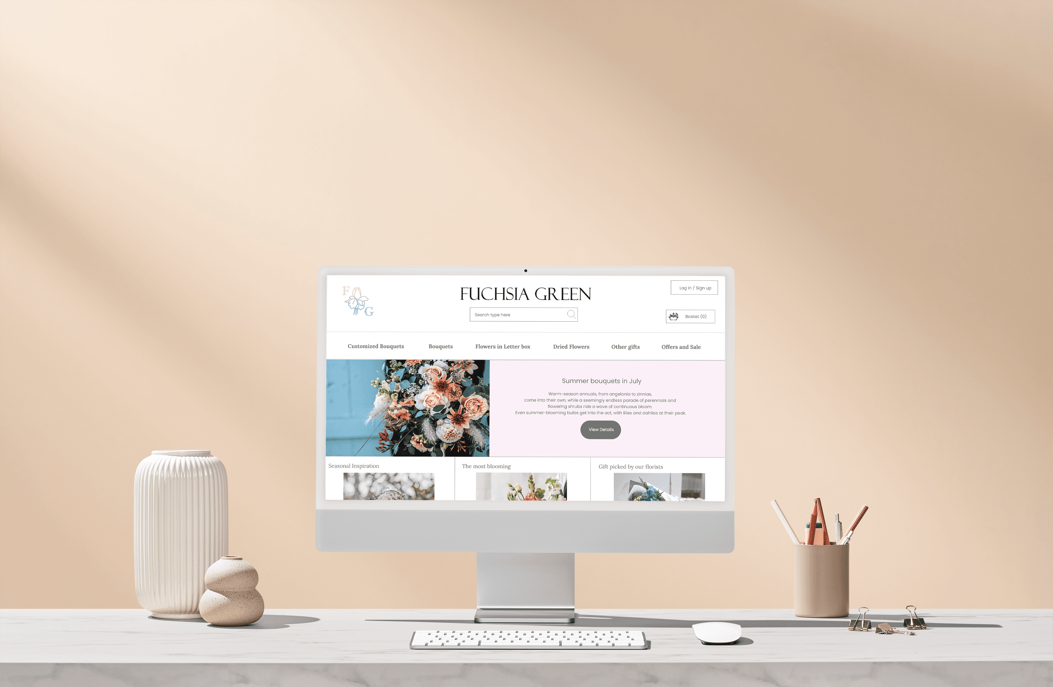
Fuchsia Green is a florist business that wanted to expand its reach by offering its products online. As a UX designer, my responsibility was to design the new website for Fuchsia Green that would make it easy for users to order and get flowers delivered to the recipient's door. This case study outlines the process I followed to design their website, from conceptualization to the final product.
To begin the design process, I conducted a user case study to gain insight into the needs and pain points of potential users. I used a mix of methods such as online surveys and in-person interviews to gather data, and created user personas to help me better understand the needs and motivations of potential users. Through this study, I learned that busy workers, in particular, often didn't have time to buy flowers for special occasions. I also conducted a competitive audit to see what other flower delivery services were currently available in the market. This audit helped me identify common features and areas of improvement for Fuchsia Green's app and website.
From my research, I discovered that users wanted an easy-to-use platform that was visually appealing and informative. They also wanted a variety of options for flowers, along with customizable arrangements and personalized messages. Lastly, they wanted a reliable and efficient delivery service.
Based on these findings, I created paper wireframes to test different layouts and features. Once I received feedback from potential users, I created digital wireframes and low-fidelity prototypes. These prototypes were tested in usability studies to identify areas that needed improvement. I used a combination of digital tools such as Adobe XD and Figma to create and test different design options, and collaborated closely with the development team to ensure that the design was feasible and could be implemented in a timely manner.
Digital wireframes were built to draft iterations of each screen of the website. I prioritized a simple and easy user flow to complete orders to help users save time.
Easy access and informative user experience needed to be addressed in the designs in addition to equipping the app to work with assistive technologies.
Using the completed set of digital wireframes, I created a low-fidelity prototype. The primary user flow I connected was browsing the products and completing an order, so the prototype could be used in a usability study.
After incorporating feedback from the usability studies, I created high-fidelity prototypes that included features such as an interactive floral arrangement builder and a checkout process that was clear and easy to navigate. Throughout the design process, I also accounted for accessibility, ensuring that the app and website were usable for all users, including those with visual impairments.
High-fidelity Prototype CLICK HERE
FINDINGS FROM THE USABILITY STUDIES
Users wanted a clear sign of the item successfully being placed in the basket.
Users wanted go back to the home page from different points before completing the tasks.
Users wanted to edit delivery times and payment types.
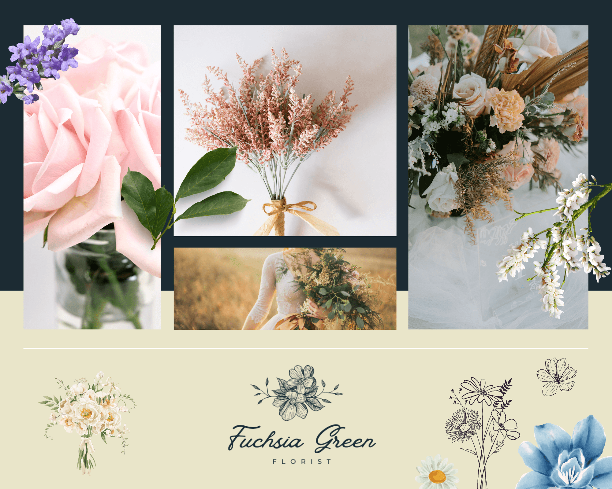
In terms of design, I had to consider the business goals of Fuchsia Green, including their target audience and branding. This involved creating a design that would appeal to a broad range of users, while also staying true to the Fuchsia Green brand and aesthetic.
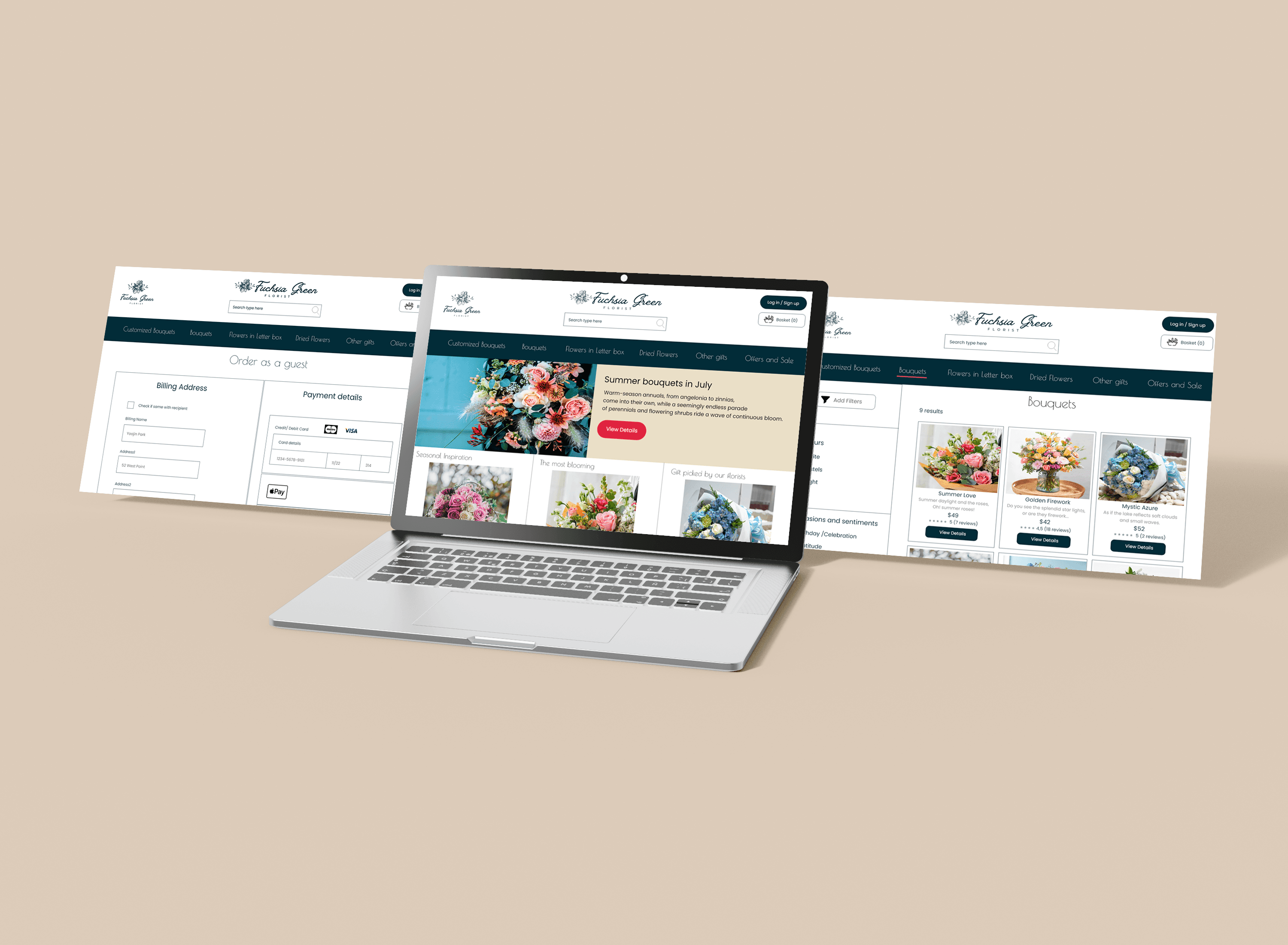
The final website design for Fuchsia Green included a visually appealing interface with an easy-to-use layout. The app and website allowed users to browse different flower arrangements and create customized ones, with personalized messages and delivery instructions. The checkout process was straightforward and allowed users to track their delivery status in real-time.
The website helps the users meet their needs and makes them feel satisfied.
One quote from peer feedback:
“The site was clear and functional - I could imagine using this as part of a real order.”
From this case study, I was able to gain experience designing responsive website and a mobile app. I considered different factors for multiple device screen sizes including consistency, continuity, context and complementary design. Also, the usability studies and peer feedback were extremely important and gave me broader perspectives to improve the designs.
In conclusion, the design process for Fuchsia Green was a collaborative effort involving multiple stakeholders, including the development team and business owners. Through user research and iterative design, we were able to create the website that met the needs of potential users while also incorporating Fuchsia Green's brand and business goals. The design process involved a mix of methods such as user case studies, wireframing, prototyping, and usability testing, and was driven by a deep understanding of user needs and preferences. The final product was a visually appealing and easy-to-use platform that allowed Fuchsia Green to expand their reach and revenue.
Other works
