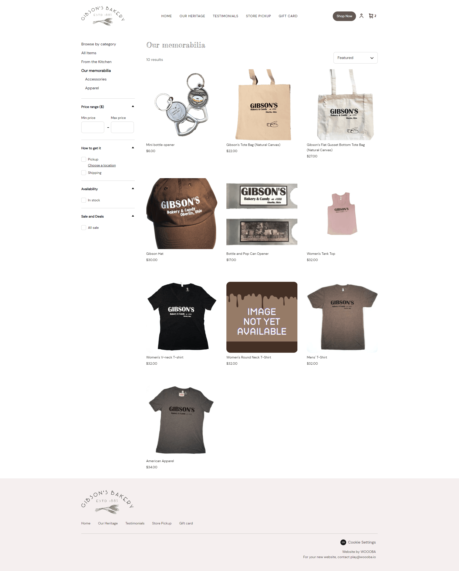
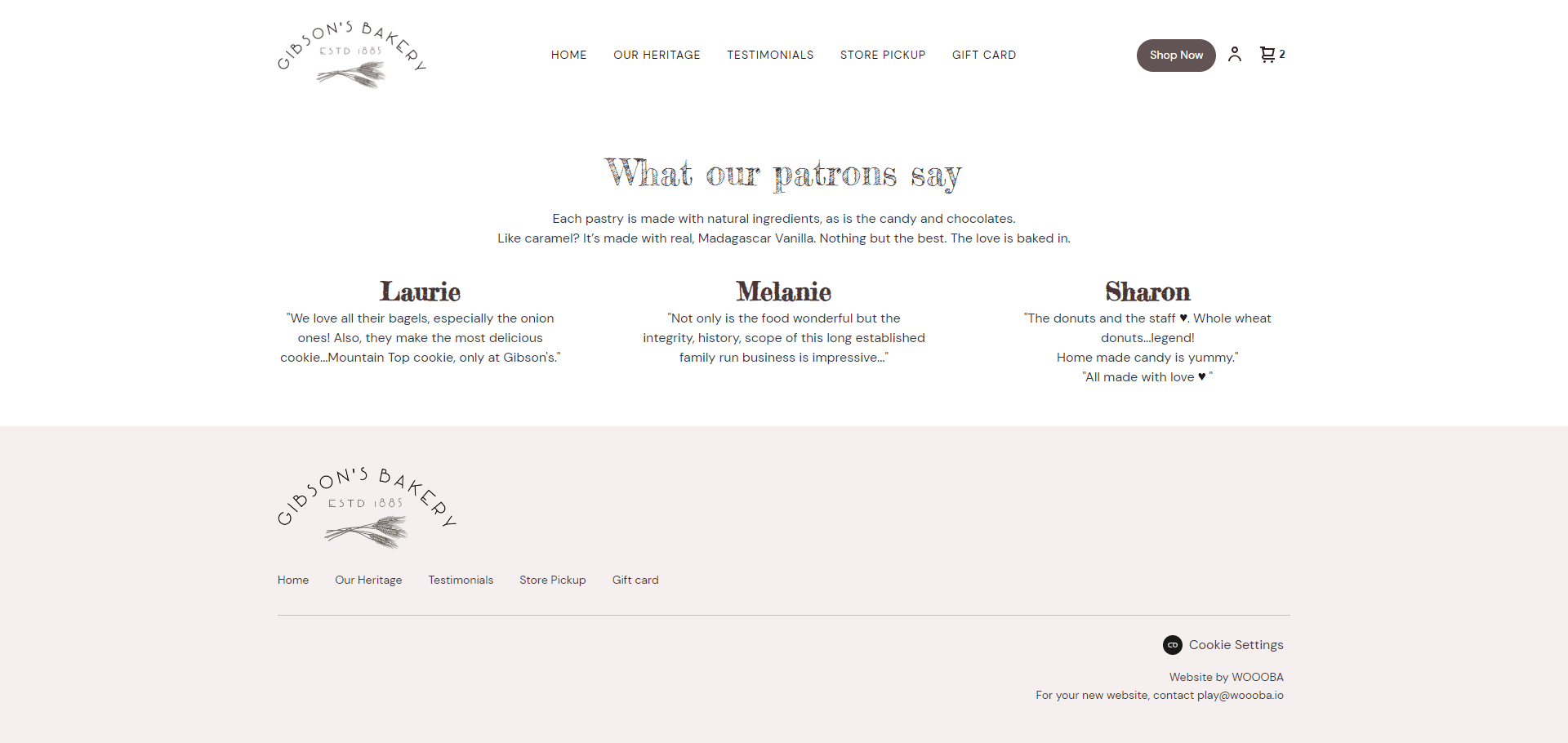
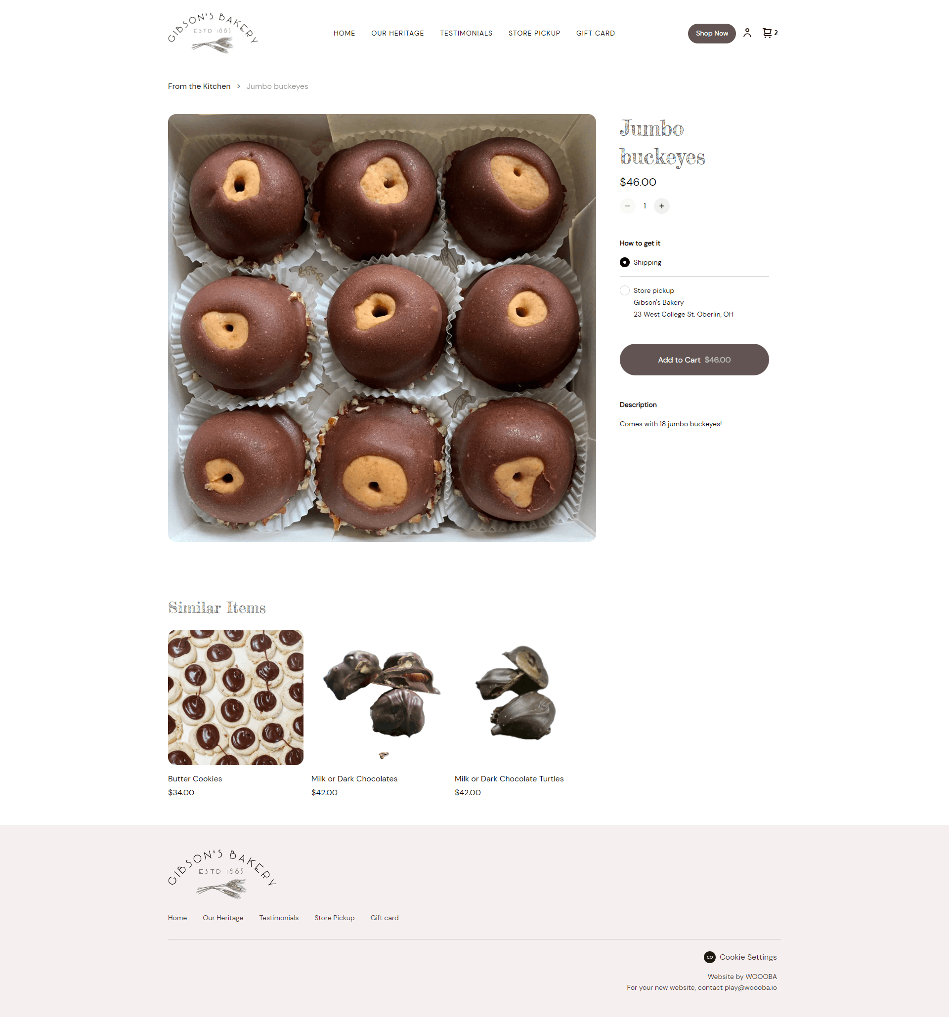
As a UX/Graphics Designer, I had the opportunity to work on the redesign of the Gibson's Bakery website. Gibson's Bakery is a well-known bakery in Ohio that has been serving customers since 1885. The bakery is known for its delicious pastries, bread, and cakes, and the owners wanted to update their online presence to match the quality of their products.
The project began with a thorough analysis of the existing website. I reviewed the website's user flow, layout, and overall visual design. I then collaborated with the client to determine their specific goals and needs for the redesign.
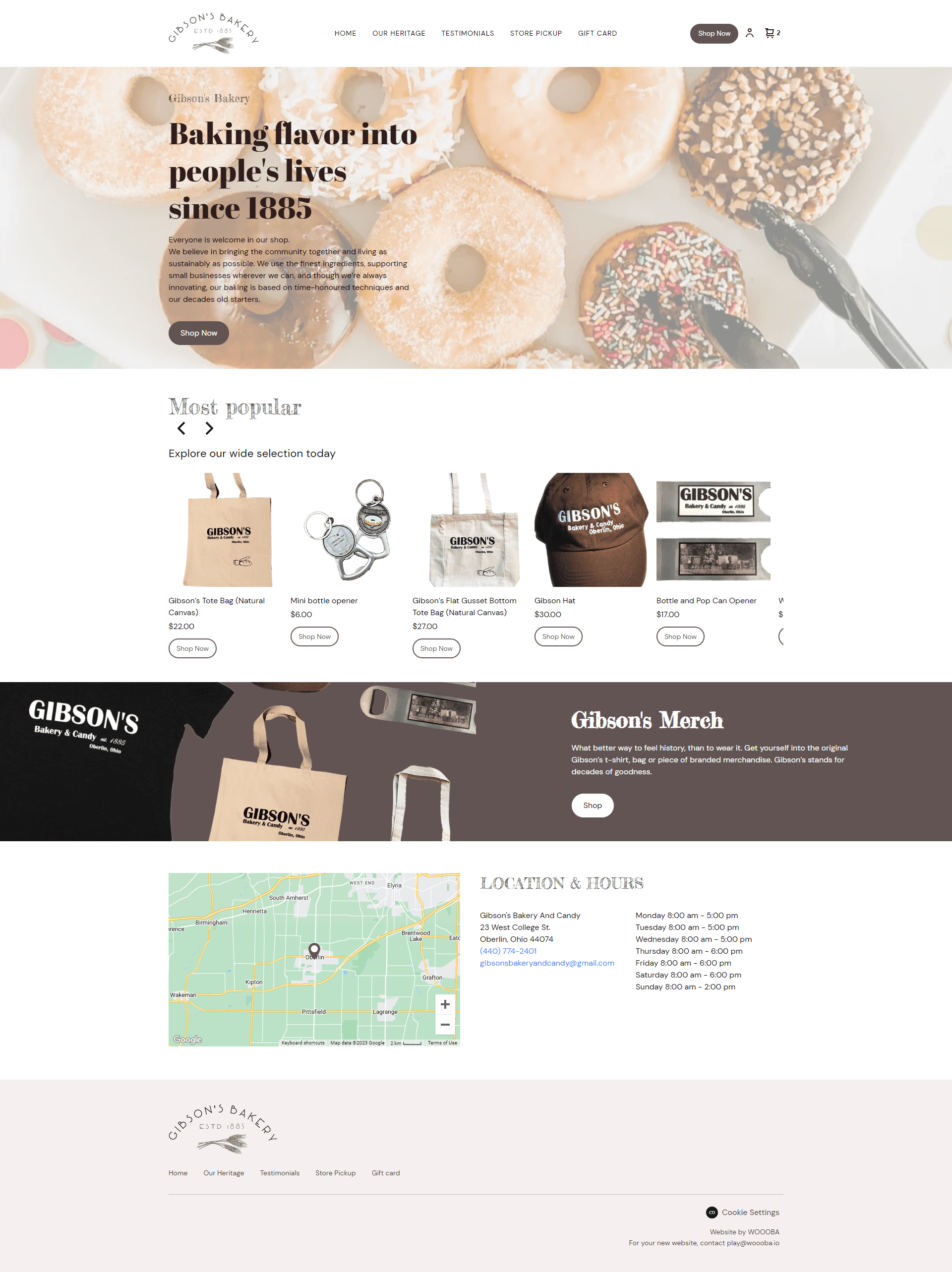
One of our primary objectives was to create a user-friendly interface that would make it easy for customers to find what they were looking for. I also wanted to highlight the bakery's long history and traditional approach to baking.
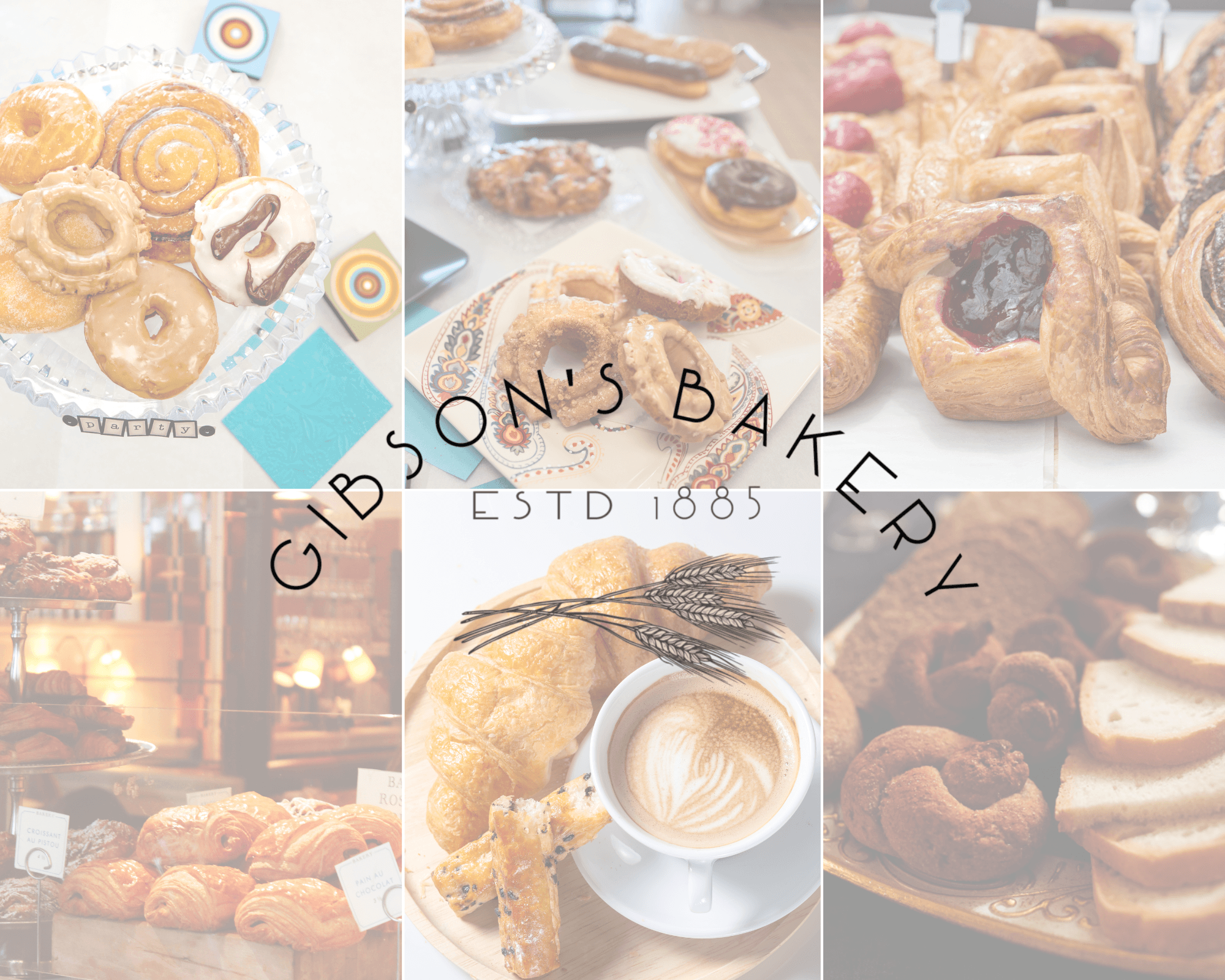
To achieve these goals, I created a design that was both visually appealing and easy to navigate. I used a simple color scheme that was inspired by the bakery's signature yellow and brown color palette. I also used high-quality images of the bakery's products to showcase their delicious offerings.

In terms of the user experience, I made sure that the website was responsive and mobile-friendly. I optimized the website's load time to ensure that it would load quickly for all users, regardless of their internet connection speed.
I was able to challenge myself and use the website builders such as Wordpress and Square. I was able to learn how to implement the design into basic code. I used basic HTML, CSS, and JavaScript to create a website that was not only visually appealing but also highly functional. I made sure that the website was optimized for search engines and that it was accessible to users with disabilities.
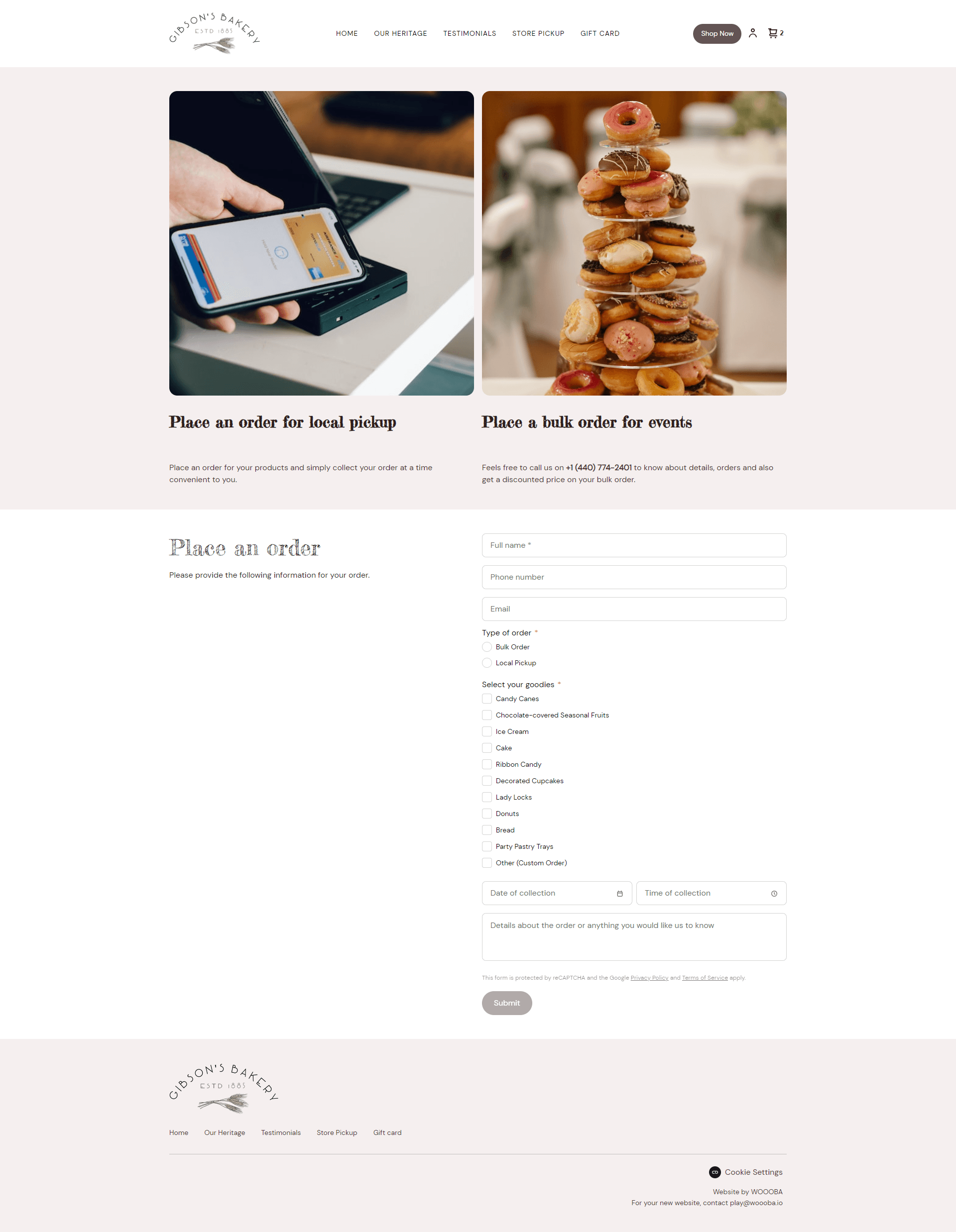
Throughout the project, we maintained open communication with the client to ensure that their needs were being met. We provided regular updates and made adjustments based on their feedback.
The end result was a website that effectively showcased Gibson's Bakery and its products. The website received positive feedback from both the client and their customers, and the client saw an increase in online orders and foot traffic to their brick-and-mortar location.
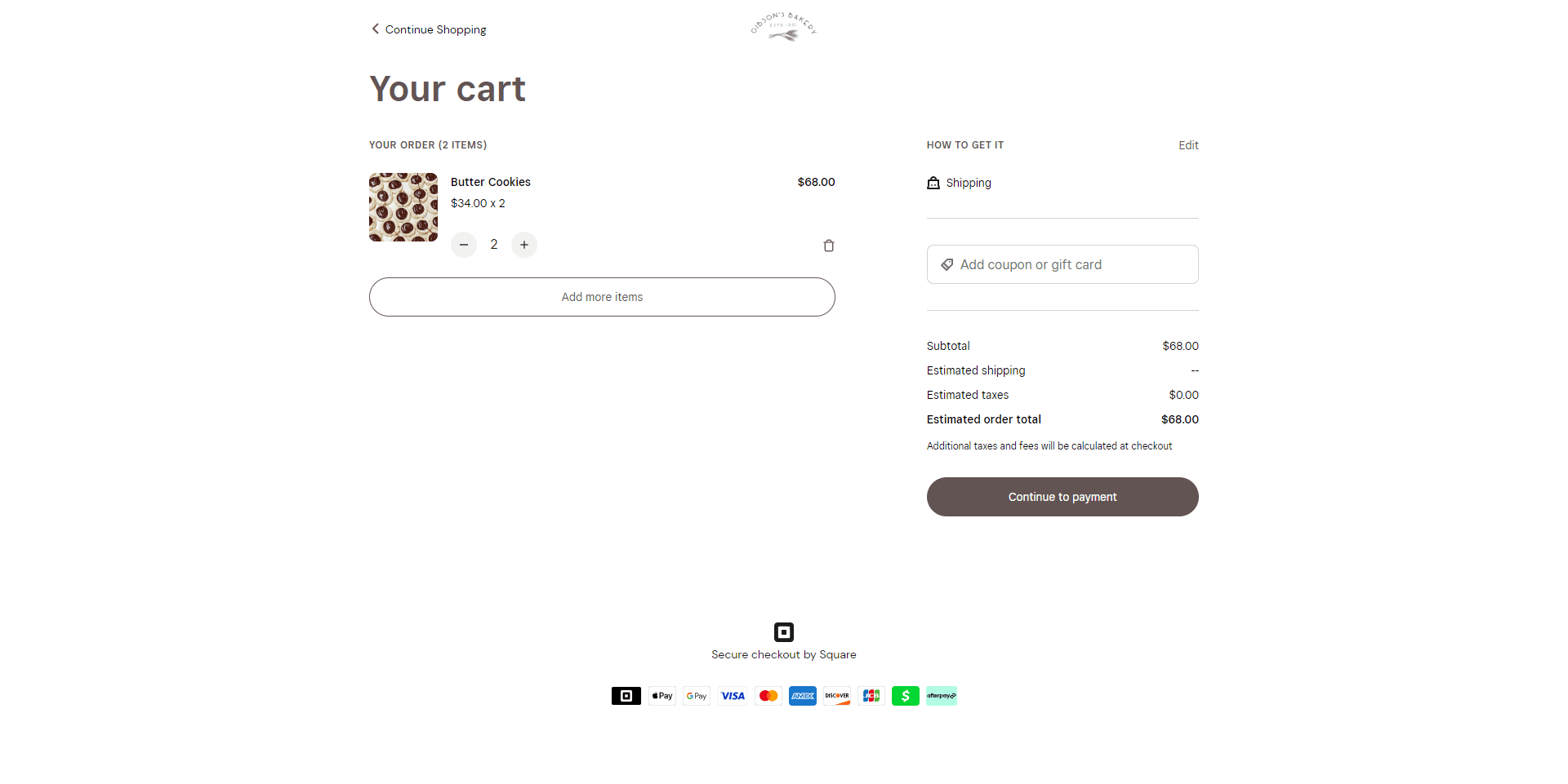
In conclusion, the redesign of the Gibson's Bakery website was a collaborative effort between our team and the client. By combining UX design principles and front-end engineering skills, we were able to create a visually appealing and highly functional website that met the client's specific goals and needs.
Other works
